Create a limited edition physical print publication which describes a micro narrative inspired by observed or real life events.
– keeping a visual diary: drawing from life, direct observation and experience, conceptual lenses, serves as a repository of ideas to inspire the micro narrative.
– micro narrative: inspired by real-life events no matter how fantastical the fiction is, finding creative inspiration in everyday life, narrative is communicated without written text, words, type, or symbols, the only type is on the cover.
– publication: physical printed publication, explore different physical forms like paper stock and binding to explore how it informs narrative, maximum of two sheets of a3 paper including the cover, can be any size, page number, fold, cut, must make three identical printed publications, two colours only plus the colour of the paper stock.
Consider what story I want to tell. What do I feel needs to be told, what do I want to platform. Research publication and print culture. Reproduction and mediated artwork.
Artist research: Esther McManus, Printed Matter NY, Sick Magazine by Kaiya Waerea, Jess Nash, Olivia Twist, LCC zine collection, https://queer.archive.work ,
Any media can be used to create my visual images. But consider materiality and the fact I need to reproduce it.
Not original artworks, three identical booklets, it has to go through a print process.
Our first workshop task was life drawing in connection to the micro narrative part of our project.
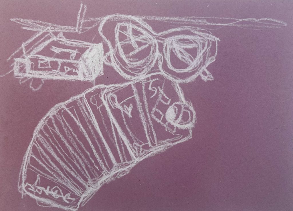
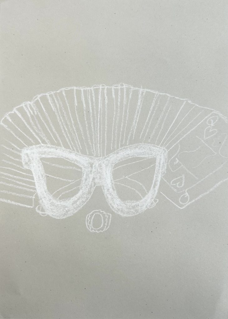
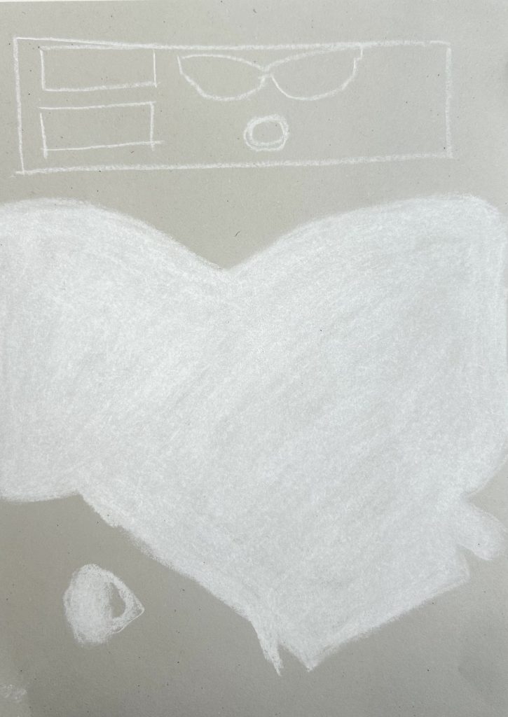
I brought in objects that I used in my life often. Then used a viewfinder to create a new point of view to create sketches with white chalk on coloured paper. I had to emulate emotions into different sketches which was difficult for me because I struggle with explicitly stating emotions in an abstract way, autism perhaps?
My objects were a pack of cards, my sunglasses, and my ring.
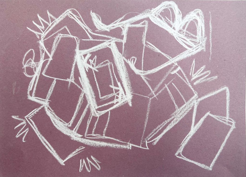
This drawing was done in a continuous line.
This was just using blocked out shapes to draw what I had composed with my objects.
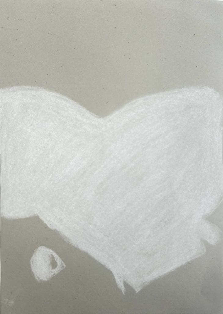
I had to draw this with ‘affection’ I really struggled with this so my next best option was to compose my objects in a way that made me feel emotions that I connect with affection. This is how I relate things due to my difficulty processing emotions. This image has as much symmetry as I could do and the only card seen is the Queen of Hearts which I associate positively.
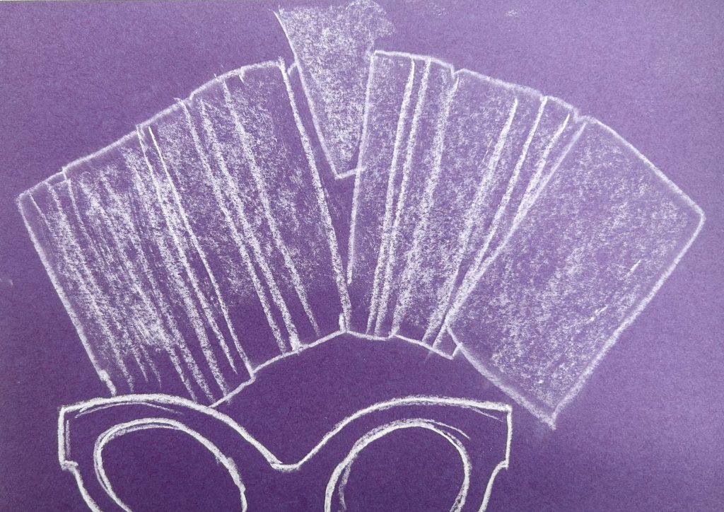
For this we had to draw on top of a previous image but ‘nervously’. I drew in a timid way very neatly with minimal lines as if the sketch is too scared to overstep any boundaries.
This sketch is ‘angry’, expressing anger in art is something commonly seen as it is a powerful emotion. I made very strong lines without much thought, almost irrationally. I composed my objects in a messy way all the cards being backwards except the King of Hearts which, to me, is a foil to the Queen of Hearts. A lot of the time I feel a lot of ‘female rage’ most times directed toward men so that’s why I highlighted that particular card. I made it messy because I hate mess and disorganisation. (It drives me crazy). I also turned the glasses upside down to exhibit chaos, as chaos makes me angry.
I had to sketch this ‘passionately’ so I used curved lines with flicks in a ‘bouncy’ kind of way. Curvy and flicked lines makes me think of that vibe. I had one card stand out/poke out in flirtatious manner. The lens on the glasses are vaguely heart shaped.
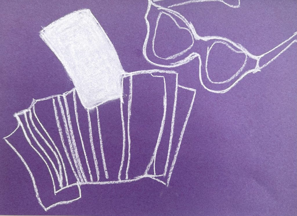
in this task we had to emphasise texture. So I used my finger to soften the lines on the softer cards in comparison to the hard plastic of the glasses which I used strong solid lines for.
We then folded the pages into A5 and used an elastic band to bind them together. This was to show us how easily a mini publication can be made.