Colour psychology dates back to 1910 where in Wolfgang von Goethe’s publication, “Theory of Colours” he imagined that there were “plus-colours” and “minus-colours.” Plus colour (yellow, yellow-red, and red-yellow), were colours that uplifted the spirit, and minus colours (blue, red-blue, and blue-red), did the opposite.
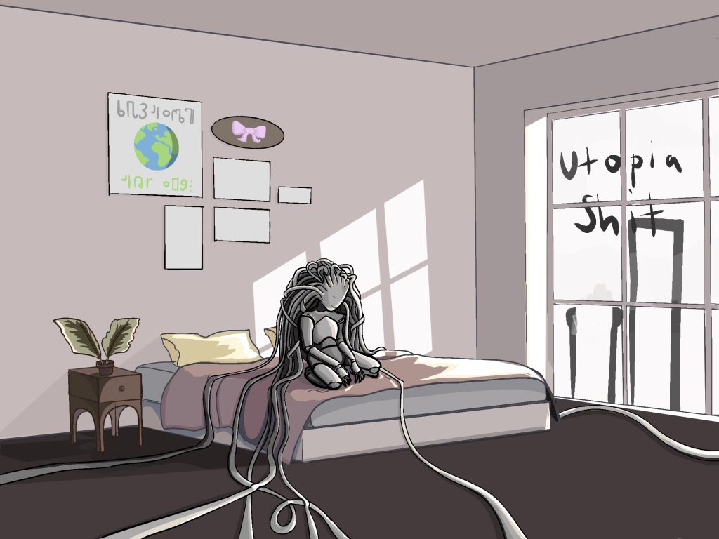
However, when you involve brightness, saturation, tone, and hues, I think it becomes more complicated. For example, I showed the below image to my flatmate and asked what made her feel ‘happier and more uplifted’ exactly and she said the blue tones. which would contradict Goethe’s sayings. I believe that it is subjective to the person.


When I showed this second image, she thought the right colour was ’happier and more uplifting’. I did not change any of the values in the colours except the brightness. So in a way if I keep the colours in my images bright, not necessarily saturated but I think thats ideal.
Goethe proposed that plus and minus colours when exposed to people, implicitly cause physical effects on them. Since 1910, colour psychology has become more connected with how people associate colour with emotions and thoughts, and less how it physically afflicts them. Colours effects are not because of biological interaction between the human brain and the colour itself, as Goethe’s proposed, but because of the associations humans have given colours over time.
Jadee Hill did a study on the usage of colour in utopian texts in her blog and found this:
Silver/Gray, Gold, and White lead significantly, and require the most analysis. Silver and gray are associated with industry, technology, and modernity because of the color of steel and other construction metals. Future societies bedecked in chrome has become a cliche in science fiction, which is why it is not surprise that it was so prominent in these Utopian texts.
I already know I want to include robots and technology so this just affirms that I am correct to go into that direction. I also want to add onto this that the colours silver and gold are colours of winners, medal are these colours and make you think of victory and success.
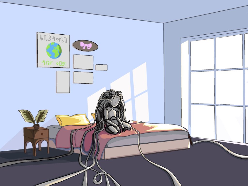
So as much I liked the colouring in the first image the second one has a more positive atmosphere compared to the first due to this colour research I did